Brand guidelines

Made for the moment.

Why TryBooking looks the way it does: the story behind the mark, the colours and the type, and everything you need to use them properly.

A brand is not its logo.

It is how people feel when you show up, and how they remember you afterwards. Ours had stopped carrying that weight, so in 2026 we rebuilt it around the thing every event is really about: the moment.

We asked what our brand said about us

The answers were blunt.

“Our brand feels tired.”
Not vintage cool. More 2008 SaaS.
“Our brand lacks cohesion.”
“Our brand lacks differentiation.”
“Our brand doesn't reflect our values.”
We're built on human connection, and our look felt disconnected from the people using it.

Nike does not sell shoes, it sells achievement. Ticketing platforms sell tickets. We sell the moment you were there for.


Downloads

Use the logo

Every mark below is a one-click SVG download. Take what you need, keep the colours honest.

Preview on
TryBooking logo in ink
Ink
TryBooking logo in sage 900
Sage 900
TryBooking logo in blue 600
Blue 600
TryBooking logo in coral 500
Coral 500
TryBooking logo in gold 500
Gold 500
TryBooking logo in sage 500
Sage 500
TryBooking logo in peony 300
Peony 300
TryBooking logo in white
White

App icon tiles

The logomark on a rounded square, in nine colourways. Use them for avatars, app icons and social profiles where the full logo has no room to breathe.

Give it room

Clear space of at least the logomark's height on every side, a background it can hold its own against, and the full lockup wherever there is room for it.

And never do this

  • Stretched or squashed

    Scale it evenly, always.

  • Rotated

    It sits level, even when the layout does not.

  • Gradients and effects

    Flat colour only. No shadows, outlines or glows.

  • On a busy background

    It needs quiet space and real contrast.

Colours

A palette, not a colour

Ticketing brands tend to pick one colour and paint everything with it. Events do not happen in one colour, so we built a palette: warm paper, deep sage, and pops that flex to the occasion.

Typography

Type with a memory

Two typefaces cover everything we make. One remembers where tickets came from, the other keeps things moving.

Gruffy

Display font · H1, H2 headlines

A soft slab serif holds warmth at any size, the way a vintage playbill does, and stays distinct in a category full of interchangeable sans serifs.

Events made easy.

Fair, transparent pricing.

Weights: Bold (700), ExtraBold (800), Black (900)

Aeonik

UI font · body text, buttons, labels, H3 to H6

The plain-spoken workhorse. It stays out of the way so the words can do their job.

The easy, trusted way to run your next event

Run a school fete, a gala dinner or a thousand-person festival. TryBooking gives you the tools to create, sell and manage with confidence. No fuss, no surprise fees.

Label · uppercase · black 900

Weights: Regular (400), Medium (500), Bold (700), Black (900)

Photography

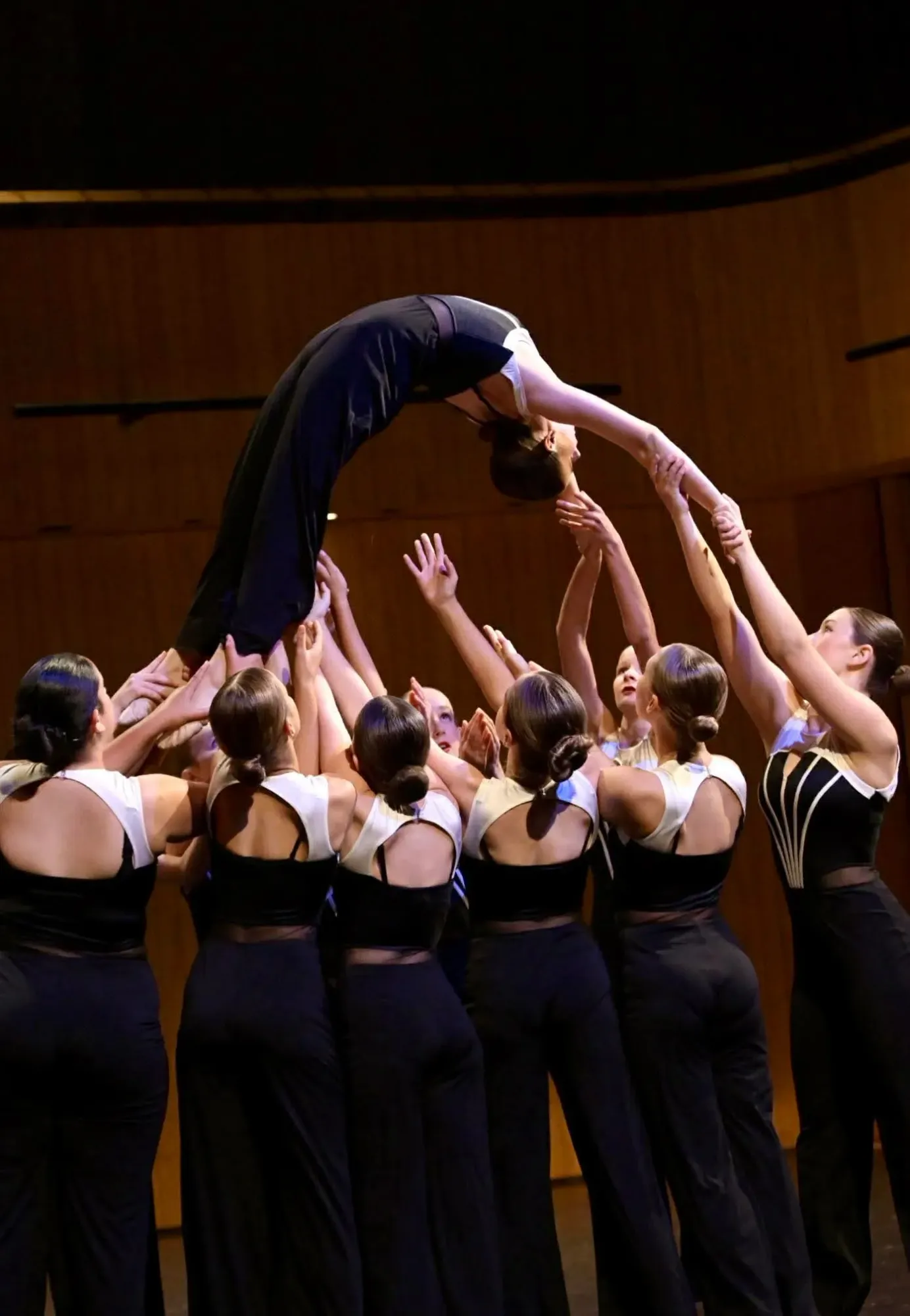
Think Kodak moment

Our photos look like someone was there, because someone was. Three rules keep them that way.

Dancers lifting a performer overhead mid-routine at a DanceForce event in New Zealand

Candid over posed

Real crowds, real mid-laugh faces. If everyone is looking at the camera, it's not our shot.

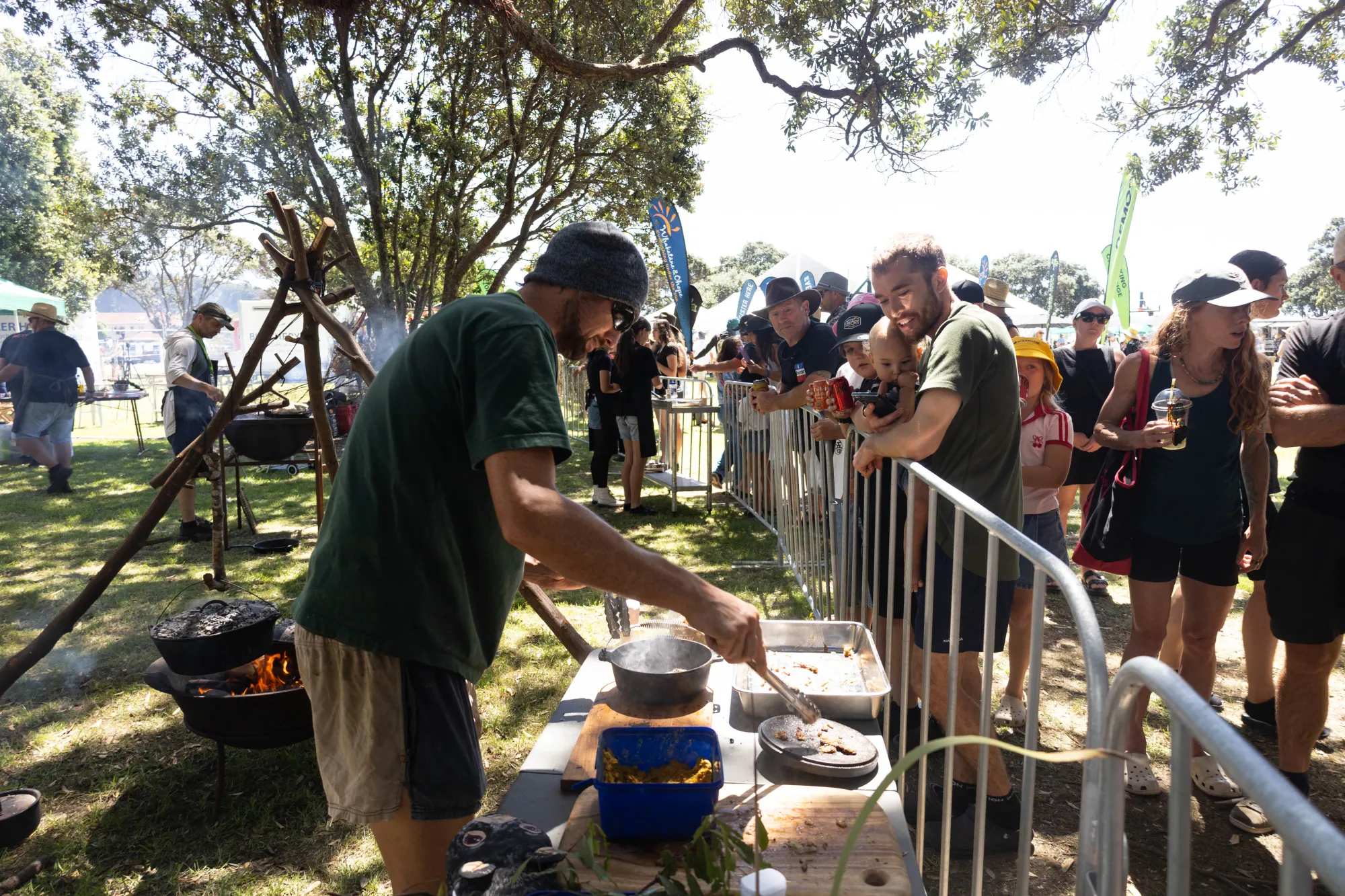
A campfire cooking demonstration drawing a crowd at the Wildfoods festival in New Zealand

Embrace imperfection

Motion blur and happy accidents stay in. Perfect is forgettable.

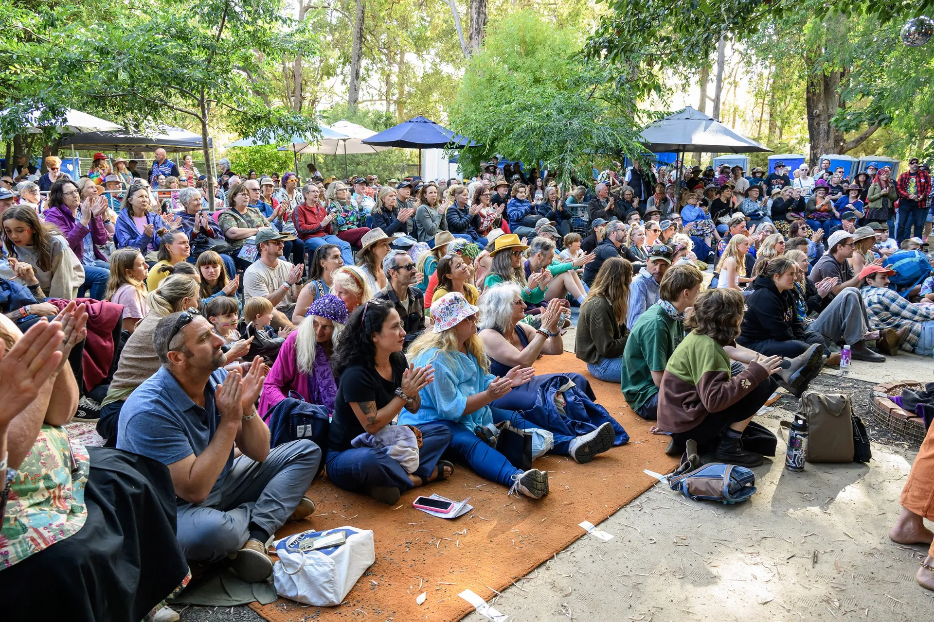
A festival crowd sitting in dappled shade at the Nannup music festival in Western Australia

Natural light first

Daylight, stage wash or a phone flash. Whatever the event actually looked like.

Graphic language

The kit of parts

A few treatments, combined endlessly: block colour, rounded shapes, and motifs borrowed from the way people keep memories.

Perforations

Sections join the way a ticket joins its stub. Every seam on this page is doing it right now.

Ticket spools

Strips of gloriously specific event names, because the platform is whatever people make on it.

Block colour, rounded shapes

Flat and friendly, with nothing hiding behind a gradient. The polaroid frames in the photography section are part of the same family.

Icons and illustrations

The supporting cast

Small things carry a lot of the warmth. Two-tone icons in brand colours, and hand-drawn marks where a shape would feel too corporate.

Illustrations

Hand-drawn illustration for powerful yet simple tools
Hand-drawn illustration for local support

made

The brush underline, reserved for one word at a time.