TryBooking looks different. Same team, same platform, same fees, and nothing about your events has changed.
In 2026 we gave the brand a full refresh: new logo, new colours, new lettering and new photography. This guide covers what’s new, what hasn’t moved, and whether you need to do anything.
The short version
- The look has changed, and that’s all
- Your events, your fees and your account work exactly as before
- You don’t need to do anything
- If you use our logo anywhere, pick up the new files whenever it suits you
What actually changed?
Only the look. There’s a new logo, warmer colours, new lettering, and a different style of photo.
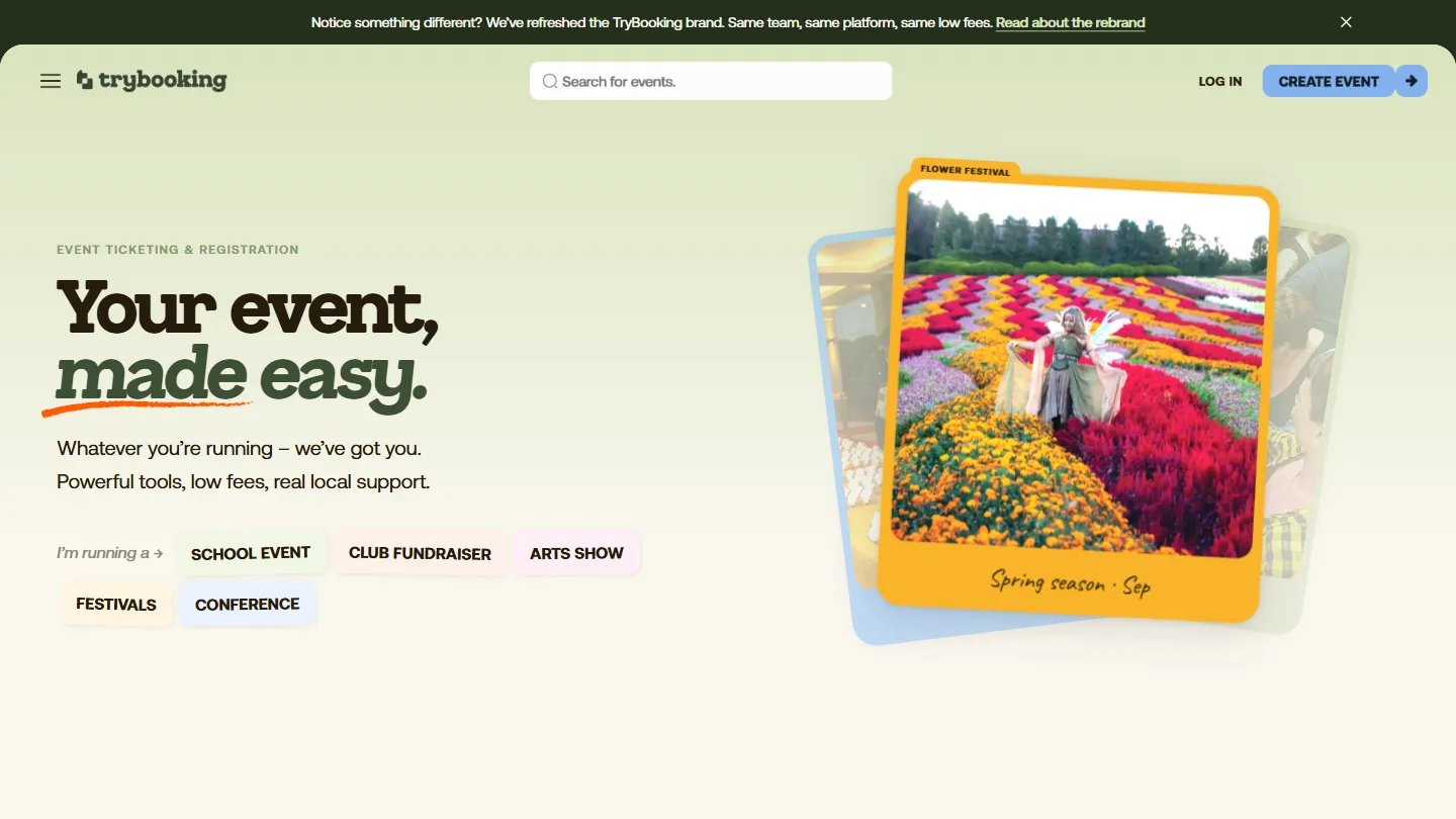
You’ll see it on the website first, then gradually on emails, help articles and anywhere else we turn up. We’re changing things in stages rather than all at once, so you might see the old look and the new one at the same time for a while. That’s normal.
Has anything changed about how TryBooking works?
No. Same team, same platform, same fees.
We haven’t touched pricing, features, or the way you set up and run an event. A rebrand is a change of clothes, not a change of business.
If something looks broken rather than just new, please tell us. Our client success team would much rather hear about it early.
Do I need to do anything?
No. Your events carry on exactly as they are.
One thing worth knowing: if you put our logo on a poster, a programme or your own website, there are new files to pick up when you get a chance. They’re on the brand page, and there’s no deadline.
Why change it?
We asked people what our brand said about us, and the answers were blunt. What we had still worked, but it had stopped meaning much.
Every event is really about one thing: the moment it happens. We wanted a brand built around that, rather than around tickets.
The new logo
It isn’t a ticket. It’s the moment the ticket is for.
Printed tickets used to work a bit like keys. Every one was different, and people kept them in drawers and scrapbooks long after the night was over. That ticket stub is where the new logo starts.
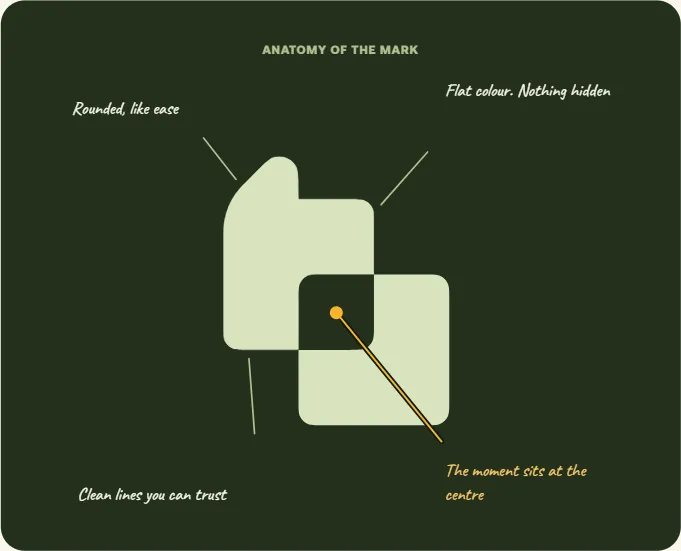
The word TryBooking sits in rounded, slightly old-fashioned lettering. Warm and familiar, a bit like an old theatre poster, but drawn cleanly so it still feels current.
The colours
Most ticketing brands pick one colour and use it for everything. Events aren’t one colour.
So we use a set instead: warm paper, deep green, and a few brighter ones for when the occasion calls for it. A school play and a food festival shouldn’t have to look like the same night out.
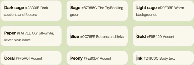
Each one has a job. Blue is for buttons and links, dark grey is for reading, and the bright colours are used sparingly.
The lettering and the photos
Two fonts cover everything we make. One for headings, one for everything else.
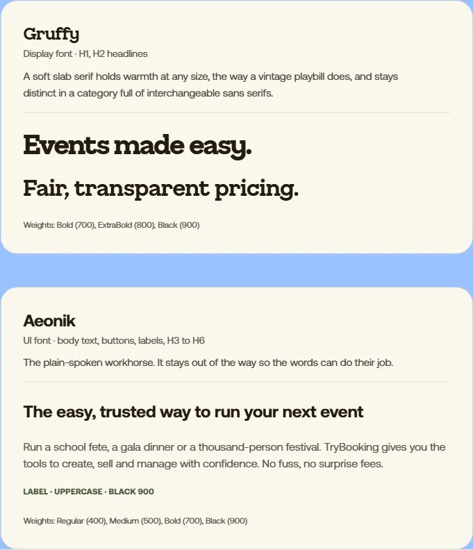
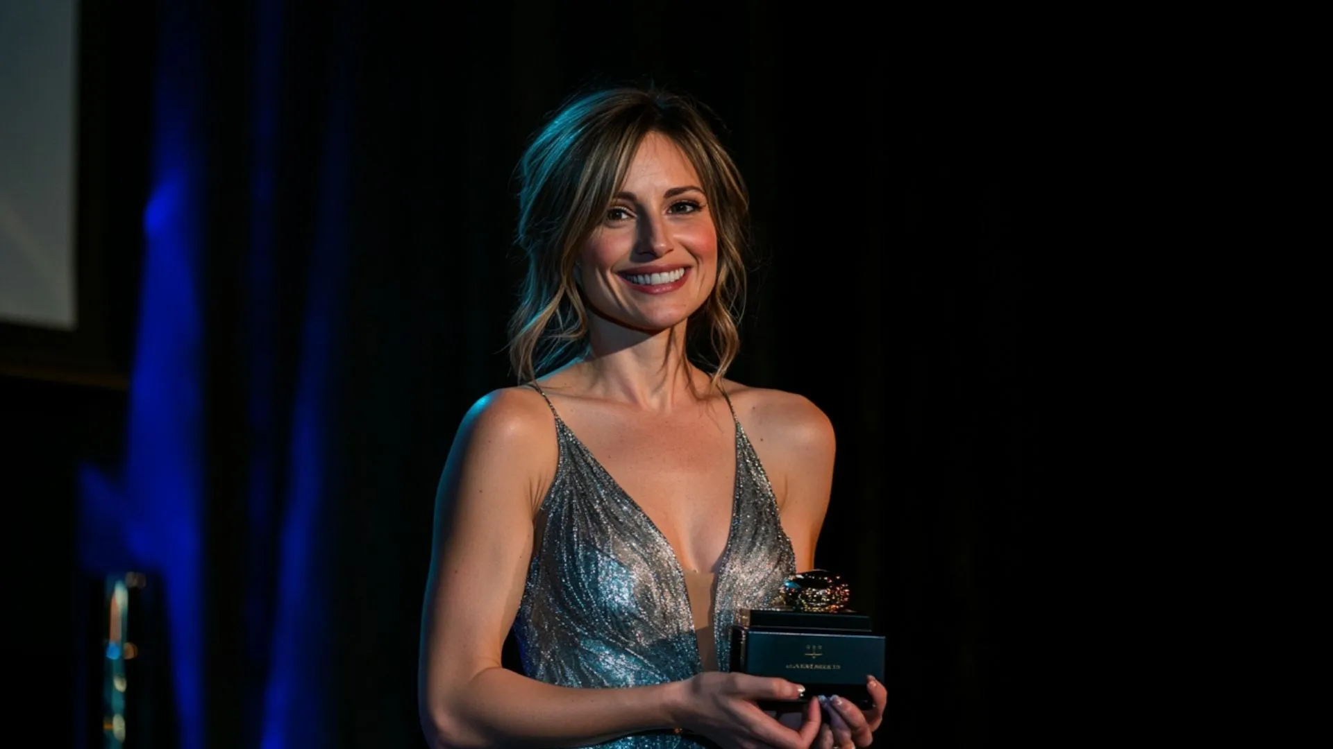
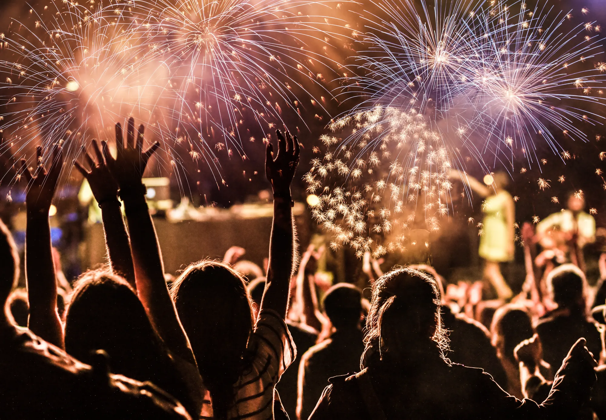
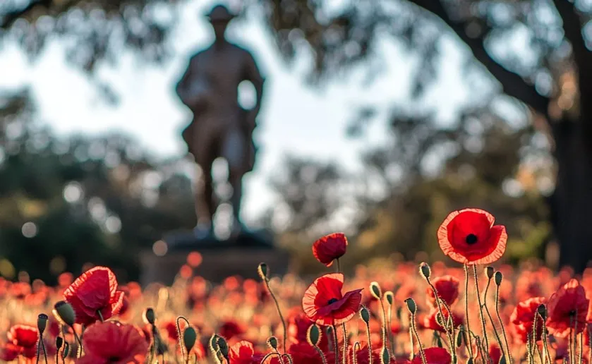
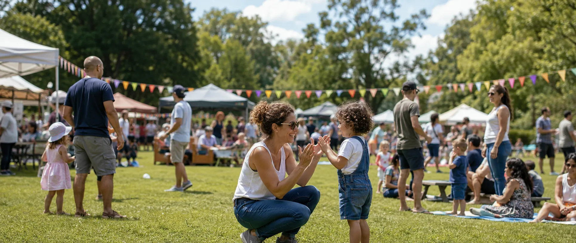
The photography changed the most. Three rules decide what we use:
- Real moments, not posed ones. If everyone’s looking at the camera, it isn’t our kind of photo
- We keep the imperfect shots. A bit of blur is fine, because perfect is forgettable
- Natural light wherever we can. Daylight, stage lighting or a phone flash, whatever the event actually looked like
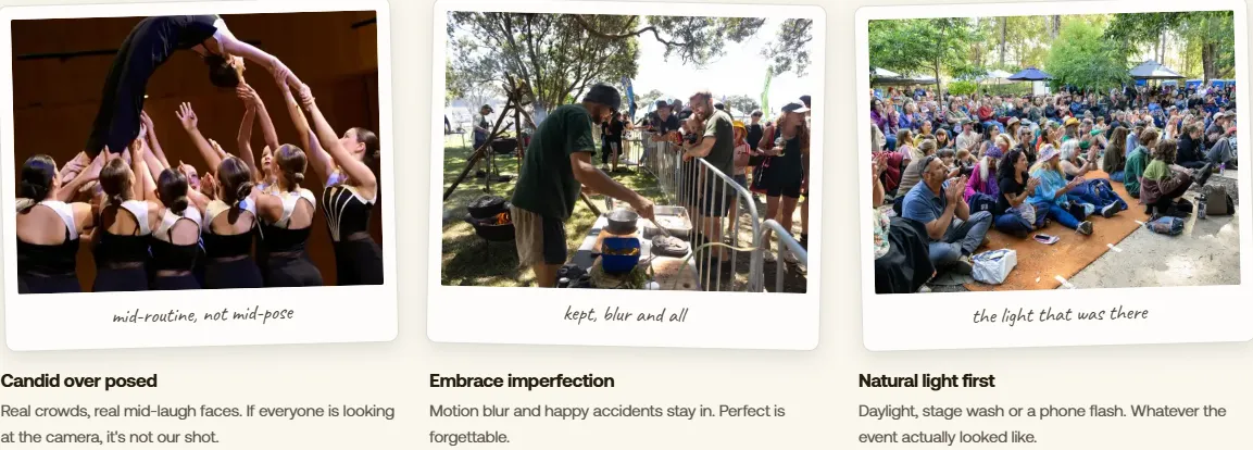
In short, our photos should look like someone was there, because someone was.
Want the full story?
The brand page has all of it: the logo and the thinking behind it, every colour with its code, the fonts, the photography rules, and the logo files to download.
Worth a look if you’re curious. If you only wanted to know whether anything about your events has changed, the answer is still no.